On this blog is my media coursework for OCR A2 Media!
I hope you enjoy viewing my work!
Thank you,
Amy Irons.
Saturday 16 February 2013
Friday 15 February 2013
Evaluation Question 4. How did you use media technologies in the construction and research, planning and evaluation stages?
Prezi did not allow me to upload screenshots, therefore I have made a document below of examples of the technologies talked about in the Prezi above.
Monday 11 February 2013
Evaluation Question 3. What have you learned from your audience feedback?
Since making this video I have also had viewers from Mexico, USA, Phillippines and Portugal as well as Australia. Below are figures that I gathered off my Youtube account analysis.
You can also see from the pie charts below that the majority of viewers viewed the video on Youtube, therefore using a mobile phone in my music video was appropriate for the target audience.


Saturday 9 February 2013
Evaluation Question 2. How effective is the combination of your main product and ancilary texts?
Brand Identitiy
Whilst making my music video and ancilary texts I consistently was trying to focus around a brand identity.
My music video focuses on the narrative of a girl who likes to be herself and act like 'one of the boys'. She then decides she wants to become a girlie girl to get the boy she likes to notice her, and to 'try and fit in', which many young girls can relate to in today's society. She has a makeover and her new look blows the boy away. Although, she ends up showing her boisterous side again when she gets jealous of another girl, and she starts a fight. At the end of the narrative the boy she likes puts her 'boyish' hat back on her, which is symbolic of her being loved for being herself. Therefore throughout my music video I wanted to promote the image of her being herself, and that it's okay to be different.
I consistently wanted my media texts to appeal fun, energetic and carefree.
To create a strong brand identity, I needed to think about how to make my texts work together to represent my artist in the same way. Therefore when creating all of my products I focused on...
1. Theme
-Intertexual References
2.Style
-Font
-Mise-en-scene
3.Colour
-Scheme
-Locations
Theme
Throughout my music video I made intertextual references to other media texts, which have the same narrative.
Eg:
- Shes The Man
- Taylor Swift as she walks in transformed
- Pink Ladies
- Cinderella Story
The main theme I used was Pink Ladies. As it is a classic film, and my music video narrative has the same basic plot. Todorov's narrative theory can be applied to my music video and similarly to the film Grease (explain in question one). Both are based on the main girl not fitting in, so she has a makeover, and then at the end she is liked for being herself.
In my music video the artist wore a black leather jacket in the white background shoot (T-birds). The other two girls wore pink ladies jackets. I used this shoot for the choruses and the final scene in my music video. This was so that it was consistent. I also use the Pink Ladies theme throughout my ancillary texts to create a brand identity.


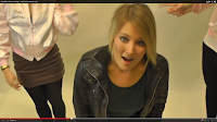
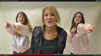
Here are some screen shots of the Pink Ladies theme being used in my video. As you can see I also edited in some very quick cuts of the Pink Ladies jacket, to reinforce Dyer's theory of representation. As I wanted to represent the girls in the background as contrasting to the artist.
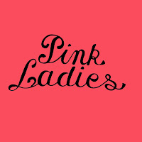
The second inlay of my album, has the Pink Ladies logo on it to reinforce the theme and compliment the music video. Also as you can see I have used a black and pink colour scheme, which also connects with the music video.
Also I used the outline of a high heel, a football and a lipstick in black and white on the back of my album cover. This is because it relates to the narrative and symbolises what happens. I chose these objects, because they are stereotypically symbolic of the binnary oppositions between boys and girls.
Style
When making my album I used three different fonts, which I downloaded from dafont.com. I used a font called 'Katy Berry' for the artist's name. I used a font called, 'Black Rose' for the album name. I used both of these fonts and the same colour scheme on both my magazine advert and album to promote a familiarity between the text. I used a very basic Times New Romans font for the small print on the back of my album, but for the main text on the back of my album I used a font called, '______________'. I also used this font for the promotion text on my magazine advert, which says, 'OUT MONDAY. FEATURES THE UK NO.1 UR SO GAY'.


I used the font, '____________' to make a sign at the end of my music video. I made a 'THE END' sign to promote the album. I also made this to continue representing the artist as fun, and to continue the scene in the arcade, along with using the same text as my print products.

The mise-en-scene I used in my music video and ancillary texts was carefully constructed to represent the same brand identity.
When I did a photoshoot for my album and magazine advert, I made the artist wear the same dress as in the last scene of the music video. I also got her to wear the hat, which is consistently used throughout the music video. The contrast of the hat and dress relate to the narrative in my music video.
Also, when taking photos I ensure she took some photos of her messing around to look fun, young and carefree. I used the same photo I used for the album cover for the magazine advert, to make sure the texts are clearly connected. I chose the image I did, because it shows her shrugging her shoulders as if to say, 'I don't know'. This reflects the narrative of my video' where she just wants to try and fit in.
Below is a visual mindmap I made to show how my main image used on my print products work with my music video. As you can see she acts silly a lot to represent the fun, clumsiness that many teenage girls (target audience) can relate too. I portayed the fun, carefree side of the artist in the music video, therefore I felt the image I used for my prints sums up my music video well.
Colour
From my Pink Ladies theme, I decided to carry on the pink and black colour scheme throughout my texts. Pink stereotypically also appeals to young teenage girls, and is bright and cheerful. I also used a hint of blue, which compliments the pink.
On my album back cover I inserted black outlines of a high heel and lipstick. This refers to props used in the music video. I also placed an outline inbetween the two 'girlie' props which denotates a black and white football, but it connotates boisterous behaviour (relating to music video narrative).
The locations used in my music video were; a classroom, hallway, bedroom, staircase, the pier, and a white background. All of the locations used were realistic, and accessible for my target audience (13-18 year old girls). I wanted to keep a bold bright colour scheme for my print products, and only use a photo of the artist. Therefore I felt that when making my album and magazine advert I needed it to foreshadow some of the narrative and locations. For the majority of the song (not the second verse, chorous or bridge) the artist's hat is present in the narrative. Stuart Hall's theory can be applied here, because I encoded all of my products with the hat, which I want the target audience to decode as being symbolic of the artist being herself.
Conclusion
Overall I think the combination of my main product and ancilary texts is strong, and all are clearly related. I consistently focused on brand identity. The Pink Ladies theme is present in my music video and ancilary texts, and the colour scheme chosen also compliments the theme. By focusing on my artist's attitude in filming and taking photos I was able to convey the same representation of her being fun, silly, carefree and trying to fit in. The mise-en-scene of the dress code used in my print products are the same clothing items used in my video, and the iconic symbolic hat features in all products. The fonts are all carefully chosen, and used variously over my products.
After showing my music video, album, and magazine advert to a group of 14 year old girls (my target audience), I can conclude that they did instantly know that the texts are linked. I have carefully constructed every element of my magazine advert and album to relate to my music video, and my audience feedback shows that the combination of my products is very effective.
Whilst making my music video and ancilary texts I consistently was trying to focus around a brand identity.
My music video focuses on the narrative of a girl who likes to be herself and act like 'one of the boys'. She then decides she wants to become a girlie girl to get the boy she likes to notice her, and to 'try and fit in', which many young girls can relate to in today's society. She has a makeover and her new look blows the boy away. Although, she ends up showing her boisterous side again when she gets jealous of another girl, and she starts a fight. At the end of the narrative the boy she likes puts her 'boyish' hat back on her, which is symbolic of her being loved for being herself. Therefore throughout my music video I wanted to promote the image of her being herself, and that it's okay to be different.
I consistently wanted my media texts to appeal fun, energetic and carefree.
To create a strong brand identity, I needed to think about how to make my texts work together to represent my artist in the same way. Therefore when creating all of my products I focused on...
1. Theme
-Intertexual References
2.Style
-Font
-Mise-en-scene
3.Colour
-Scheme
-Locations
Theme
Throughout my music video I made intertextual references to other media texts, which have the same narrative.
Eg:
- Shes The Man
- Taylor Swift as she walks in transformed
- Pink Ladies
- Cinderella Story
The main theme I used was Pink Ladies. As it is a classic film, and my music video narrative has the same basic plot. Todorov's narrative theory can be applied to my music video and similarly to the film Grease (explain in question one). Both are based on the main girl not fitting in, so she has a makeover, and then at the end she is liked for being herself.
In my music video the artist wore a black leather jacket in the white background shoot (T-birds). The other two girls wore pink ladies jackets. I used this shoot for the choruses and the final scene in my music video. This was so that it was consistent. I also use the Pink Ladies theme throughout my ancillary texts to create a brand identity.


Here are some screen shots of the Pink Ladies theme being used in my video. As you can see I also edited in some very quick cuts of the Pink Ladies jacket, to reinforce Dyer's theory of representation. As I wanted to represent the girls in the background as contrasting to the artist.

The second inlay of my album, has the Pink Ladies logo on it to reinforce the theme and compliment the music video. Also as you can see I have used a black and pink colour scheme, which also connects with the music video.

Also I used the outline of a high heel, a football and a lipstick in black and white on the back of my album cover. This is because it relates to the narrative and symbolises what happens. I chose these objects, because they are stereotypically symbolic of the binnary oppositions between boys and girls.
Style
When making my album I used three different fonts, which I downloaded from dafont.com. I used a font called 'Katy Berry' for the artist's name. I used a font called, 'Black Rose' for the album name. I used both of these fonts and the same colour scheme on both my magazine advert and album to promote a familiarity between the text. I used a very basic Times New Romans font for the small print on the back of my album, but for the main text on the back of my album I used a font called, '______________'. I also used this font for the promotion text on my magazine advert, which says, 'OUT MONDAY. FEATURES THE UK NO.1 UR SO GAY'.


I used the font, '____________' to make a sign at the end of my music video. I made a 'THE END' sign to promote the album. I also made this to continue representing the artist as fun, and to continue the scene in the arcade, along with using the same text as my print products.

The mise-en-scene I used in my music video and ancillary texts was carefully constructed to represent the same brand identity.
When I did a photoshoot for my album and magazine advert, I made the artist wear the same dress as in the last scene of the music video. I also got her to wear the hat, which is consistently used throughout the music video. The contrast of the hat and dress relate to the narrative in my music video.
Also, when taking photos I ensure she took some photos of her messing around to look fun, young and carefree. I used the same photo I used for the album cover for the magazine advert, to make sure the texts are clearly connected. I chose the image I did, because it shows her shrugging her shoulders as if to say, 'I don't know'. This reflects the narrative of my video' where she just wants to try and fit in.
Below is a visual mindmap I made to show how my main image used on my print products work with my music video. As you can see she acts silly a lot to represent the fun, clumsiness that many teenage girls (target audience) can relate too. I portayed the fun, carefree side of the artist in the music video, therefore I felt the image I used for my prints sums up my music video well.
Colour
From my Pink Ladies theme, I decided to carry on the pink and black colour scheme throughout my texts. Pink stereotypically also appeals to young teenage girls, and is bright and cheerful. I also used a hint of blue, which compliments the pink.
On my album back cover I inserted black outlines of a high heel and lipstick. This refers to props used in the music video. I also placed an outline inbetween the two 'girlie' props which denotates a black and white football, but it connotates boisterous behaviour (relating to music video narrative).
The locations used in my music video were; a classroom, hallway, bedroom, staircase, the pier, and a white background. All of the locations used were realistic, and accessible for my target audience (13-18 year old girls). I wanted to keep a bold bright colour scheme for my print products, and only use a photo of the artist. Therefore I felt that when making my album and magazine advert I needed it to foreshadow some of the narrative and locations. For the majority of the song (not the second verse, chorous or bridge) the artist's hat is present in the narrative. Stuart Hall's theory can be applied here, because I encoded all of my products with the hat, which I want the target audience to decode as being symbolic of the artist being herself.
Conclusion
Overall I think the combination of my main product and ancilary texts is strong, and all are clearly related. I consistently focused on brand identity. The Pink Ladies theme is present in my music video and ancilary texts, and the colour scheme chosen also compliments the theme. By focusing on my artist's attitude in filming and taking photos I was able to convey the same representation of her being fun, silly, carefree and trying to fit in. The mise-en-scene of the dress code used in my print products are the same clothing items used in my video, and the iconic symbolic hat features in all products. The fonts are all carefully chosen, and used variously over my products.
After showing my music video, album, and magazine advert to a group of 14 year old girls (my target audience), I can conclude that they did instantly know that the texts are linked. I have carefully constructed every element of my magazine advert and album to relate to my music video, and my audience feedback shows that the combination of my products is very effective.
Thursday 7 February 2013
Evaluation Question 1. In what ways does your media product use, develop or challenge forms and conventions of real media texts?
http://amyirons.wix.com/evaluationquestion1
Please click on this link to go to a website I made to answer this question!
Warning: Contains automatic sound
Please click on this link to go to a website I made to answer this question!
Warning: Contains automatic sound
Wednesday 6 February 2013
Survey


Here is a screen shot of the survey I made on freeonlinesurveys.com. As you can see I have upload a picture of my album and my magazine advert. I have also put a link to my music video on youtube. Below is 12 questions relating to my final products. I have purposely made some questions closed (yes/no) and some questions opened to get a variety of feedback. I am allowed to use this website for up to 50 responses.
Construction - Music Video
Final Music Video for Katy Perry's One of the Boys!
Today I have uploaded my final cut of 'one of the boys' by Katy Perry!
I have made a survey about my music video, album and magazine advert on freeonlinesurvey.com, which allows me to get up to 50 responses. I am putting the link to the survey on the youtube video, and I am sharing them on Facebook to get feedback.
Tuesday 5 February 2013
Construction - Digipak and Magazine Advert
Here is my final digipak:
Front:
Front:

Inlay One:

Inlay Two:

Back Cover:

Here is my final magazine advert:

Monday 4 February 2013
Permission Request
Today I sent an email to Katy Perry's agent, for copyright purposes. Here is a screen shot of the email I sent asking for permission to use the track, 'One of the Boys'.


Sunday 3 February 2013
Rough Cut 2 Feedback
Feedback
I have roughly finished my music video, because it is all complete, but the middle looks a bit messy I think. Also they said the lip sync needs to be fixed in places. I was also told that the upbeat video and narrative is really interesting. I showed my video to other people and they have agreed.
To improve this I am going to edit the video here is my plan...
- From 1.07 put in some stronger shots of the chorus on the white background (-1.21)
- 1.34-1.40 stop the quick cuts, and find stronger footage to use, so that it doesn't look too fast and messy.
- 2.22 Remove the short scene of them on the weight arcade game, and use the end of the chorus to show more establishing shots of the pier, and her in her bedroom.
- 2.35 'I wanna be a flower...' Show them walking together in the pier, and use a transparent shot of her lip syncing.
- Use shots of the 3 girls lip syncing together on pier, and cut it in with the pier scene.
- Build up to fight scene, 'don't wanna be....' fade in shots of 2 girls lip syncing at either side of the screen, whilst showing the fight building. This way it will seem like the two 'girly girls' are voices in her head.
- Ending 'do do do's' shot of characters from throughout the video, and will end with a shot of a 'The End' sign.
Saturday 2 February 2013
Diary!
1. Album Progress Update
I am not very good at using photoshop, and after hours of trying to figure out the tools I have only made a very basic uninteresting front cover!

I am not very good at using photoshop, and after hours of trying to figure out the tools I have only made a very basic uninteresting front cover!

Therefore I have decided I am going to make detailed drawings of what I want the album and magazine advert to look like so that I don't forget. I can then show my ideas to other people who can teach me how to import my ideas onto photoshop.
2. Editing Update
Yesterday, there were quite a few technical errors in lesson and I wasn't able to get much done. Today I planned to spend four hours working on my editing whist the room was free to get the editing a lot closer to being finished. Unfortunately, final cut pro is playing up again, and as this isn't a lesson I can not get help to fix it. Therefore for now I plan to just focus on my digipak designs and hope the computer is fixed again soon!
Also I planned to film a shot of a game on the pier saying 'Game Over' to put at the end of my video. I didn't find a game with that shot on it, so therefore I plan to use a 'Game Over' or 'The End' sign made on photoshop or online. Something looking like this...
Friday 1 February 2013
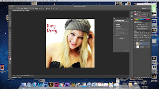
Album And Magazine Advert ROUGH
After getting some help from teachers and peers, I have been able to use photoshop to create an album and a magazine advert. I decided to change the front cover picture and use that particular image on an inlay instead. Instead of using the original design for Inlay one, I used a photo and put internet details on the back cover. I also used a QR code maker online to make a QR code that can be scanned by smartphones, and it will take viewers to the Katy Perry website. This is more advanced than my original plan, so hopefully will appeal to a wider audience by using up to date technology.


I found that photoshop allowed me to be more creative, for example, I researched the text that Katy Perry albums use, and was able to download them off a website called dafont.com. This will hopefully help make my products better than planned.
There are still some parts of photoshop that I need some guidance on understanding. For example, I want to make the 'Katy Perry' Text have a colour shading effect. Here are my rough edits of the album and the magazine advert.
Album Cover:
 I ended up using a different photo for my album cover, because there was not enough free space to write album details on the front cover with my original plan. I have still used the photo I wanted to use, but as the first inlay. This worked out well, because I was able to make a QR code for advertising. I also put links to Katy Perry's website, facebook and twitter on the back of the album in small print under the barcode.
Inlay 1:
 Looking at this album inlay along side the rest of the album, I think I have edited the image's brightness too much, and I need to sort it out. I think this is a nice picture though, and Katy Perry often has a more flattering picture inside the album cover.
Inlay 2:
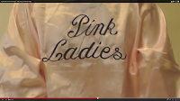
 I am happy with this inlay. I got the text for Pink Ladies online, I was planning to use the photo I took of the back of the jacket. I got the text offline, because the picture I got was blurry, and this way the inlay has turned out to a higher quality more professional standard.
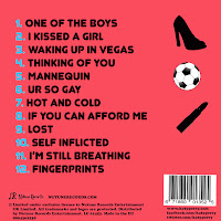
Back Cover:
 I like this back cover, because of the outlines of shapes and the contrasting baby blue colour used to number the tracks. I also created a record label called, 'Nutune Records' and I have inserted it just above the small print (copyright details).
Magazine Advert:

Feedback I have gained from these texts after showing peers:
-Need to outline the Artist name and album name so that they stand out more.
-I like the bright colours
-Edit the photos so they are all the same brightness
-I like the pink ladies theme
Subscribe to:
Posts (Atom)