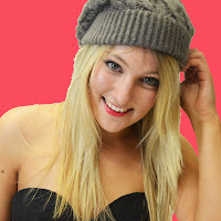
After getting some help from teachers and peers, I have been able to use photoshop to create an album and a magazine advert. I decided to change the front cover picture and use that particular image on an inlay instead. Instead of using the original design for Inlay one, I used a photo and put internet details on the back cover. I also used a QR code maker online to make a QR code that can be scanned by smartphones, and it will take viewers to the Katy Perry website. This is more advanced than my original plan, so hopefully will appeal to a wider audience by using up to date technology.
I found that photoshop allowed me to be more creative, for example, I researched the text that Katy Perry albums use, and was able to download them off a website called dafont.com. This will hopefully help make my products better than planned.
There are still some parts of photoshop that I need some guidance on understanding. For example, I want to make the 'Katy Perry' Text have a colour shading effect. Here are my rough edits of the album and the magazine advert.
Album Cover:
 I ended up using a different photo for my album cover, because there was not enough free space to write album details on the front cover with my original plan. I have still used the photo I wanted to use, but as the first inlay. This worked out well, because I was able to make a QR code for advertising. I also put links to Katy Perry's website, facebook and twitter on the back of the album in small print under the barcode.
Inlay 1:
 Looking at this album inlay along side the rest of the album, I think I have edited the image's brightness too much, and I need to sort it out. I think this is a nice picture though, and Katy Perry often has a more flattering picture inside the album cover.
Inlay 2:
 I am happy with this inlay. I got the text for Pink Ladies online, I was planning to use the photo I took of the back of the jacket. I got the text offline, because the picture I got was blurry, and this way the inlay has turned out to a higher quality more professional standard.
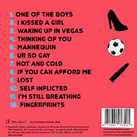
Back Cover:
 I like this back cover, because of the outlines of shapes and the contrasting baby blue colour used to number the tracks. I also created a record label called, 'Nutune Records' and I have inserted it just above the small print (copyright details).
Magazine Advert:
Feedback I have gained from these texts after showing peers:
-Need to outline the Artist name and album name so that they stand out more.
-I like the bright colours
-Edit the photos so they are all the same brightness
-I like the pink ladies theme


No comments:
Post a Comment