On this blog is my media coursework for OCR A2 Media!
I hope you enjoy viewing my work!
Thank you,
Amy Irons.
Saturday 16 February 2013
Friday 15 February 2013
Evaluation Question 4. How did you use media technologies in the construction and research, planning and evaluation stages?
Prezi did not allow me to upload screenshots, therefore I have made a document below of examples of the technologies talked about in the Prezi above.
Monday 11 February 2013
Evaluation Question 3. What have you learned from your audience feedback?
Since making this video I have also had viewers from Mexico, USA, Phillippines and Portugal as well as Australia. Below are figures that I gathered off my Youtube account analysis.
You can also see from the pie charts below that the majority of viewers viewed the video on Youtube, therefore using a mobile phone in my music video was appropriate for the target audience.


Saturday 9 February 2013
Evaluation Question 2. How effective is the combination of your main product and ancilary texts?
Brand Identitiy
Whilst making my music video and ancilary texts I consistently was trying to focus around a brand identity.
My music video focuses on the narrative of a girl who likes to be herself and act like 'one of the boys'. She then decides she wants to become a girlie girl to get the boy she likes to notice her, and to 'try and fit in', which many young girls can relate to in today's society. She has a makeover and her new look blows the boy away. Although, she ends up showing her boisterous side again when she gets jealous of another girl, and she starts a fight. At the end of the narrative the boy she likes puts her 'boyish' hat back on her, which is symbolic of her being loved for being herself. Therefore throughout my music video I wanted to promote the image of her being herself, and that it's okay to be different.
I consistently wanted my media texts to appeal fun, energetic and carefree.
To create a strong brand identity, I needed to think about how to make my texts work together to represent my artist in the same way. Therefore when creating all of my products I focused on...
1. Theme
-Intertexual References
2.Style
-Font
-Mise-en-scene
3.Colour
-Scheme
-Locations
Theme
Throughout my music video I made intertextual references to other media texts, which have the same narrative.
Eg:
- Shes The Man
- Taylor Swift as she walks in transformed
- Pink Ladies
- Cinderella Story
The main theme I used was Pink Ladies. As it is a classic film, and my music video narrative has the same basic plot. Todorov's narrative theory can be applied to my music video and similarly to the film Grease (explain in question one). Both are based on the main girl not fitting in, so she has a makeover, and then at the end she is liked for being herself.
In my music video the artist wore a black leather jacket in the white background shoot (T-birds). The other two girls wore pink ladies jackets. I used this shoot for the choruses and the final scene in my music video. This was so that it was consistent. I also use the Pink Ladies theme throughout my ancillary texts to create a brand identity.


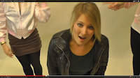
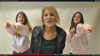
Here are some screen shots of the Pink Ladies theme being used in my video. As you can see I also edited in some very quick cuts of the Pink Ladies jacket, to reinforce Dyer's theory of representation. As I wanted to represent the girls in the background as contrasting to the artist.
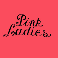
The second inlay of my album, has the Pink Ladies logo on it to reinforce the theme and compliment the music video. Also as you can see I have used a black and pink colour scheme, which also connects with the music video.
Also I used the outline of a high heel, a football and a lipstick in black and white on the back of my album cover. This is because it relates to the narrative and symbolises what happens. I chose these objects, because they are stereotypically symbolic of the binnary oppositions between boys and girls.
Style
When making my album I used three different fonts, which I downloaded from dafont.com. I used a font called 'Katy Berry' for the artist's name. I used a font called, 'Black Rose' for the album name. I used both of these fonts and the same colour scheme on both my magazine advert and album to promote a familiarity between the text. I used a very basic Times New Romans font for the small print on the back of my album, but for the main text on the back of my album I used a font called, '______________'. I also used this font for the promotion text on my magazine advert, which says, 'OUT MONDAY. FEATURES THE UK NO.1 UR SO GAY'.


I used the font, '____________' to make a sign at the end of my music video. I made a 'THE END' sign to promote the album. I also made this to continue representing the artist as fun, and to continue the scene in the arcade, along with using the same text as my print products.

The mise-en-scene I used in my music video and ancillary texts was carefully constructed to represent the same brand identity.
When I did a photoshoot for my album and magazine advert, I made the artist wear the same dress as in the last scene of the music video. I also got her to wear the hat, which is consistently used throughout the music video. The contrast of the hat and dress relate to the narrative in my music video.
Also, when taking photos I ensure she took some photos of her messing around to look fun, young and carefree. I used the same photo I used for the album cover for the magazine advert, to make sure the texts are clearly connected. I chose the image I did, because it shows her shrugging her shoulders as if to say, 'I don't know'. This reflects the narrative of my video' where she just wants to try and fit in.
Below is a visual mindmap I made to show how my main image used on my print products work with my music video. As you can see she acts silly a lot to represent the fun, clumsiness that many teenage girls (target audience) can relate too. I portayed the fun, carefree side of the artist in the music video, therefore I felt the image I used for my prints sums up my music video well.
Colour
From my Pink Ladies theme, I decided to carry on the pink and black colour scheme throughout my texts. Pink stereotypically also appeals to young teenage girls, and is bright and cheerful. I also used a hint of blue, which compliments the pink.
On my album back cover I inserted black outlines of a high heel and lipstick. This refers to props used in the music video. I also placed an outline inbetween the two 'girlie' props which denotates a black and white football, but it connotates boisterous behaviour (relating to music video narrative).
The locations used in my music video were; a classroom, hallway, bedroom, staircase, the pier, and a white background. All of the locations used were realistic, and accessible for my target audience (13-18 year old girls). I wanted to keep a bold bright colour scheme for my print products, and only use a photo of the artist. Therefore I felt that when making my album and magazine advert I needed it to foreshadow some of the narrative and locations. For the majority of the song (not the second verse, chorous or bridge) the artist's hat is present in the narrative. Stuart Hall's theory can be applied here, because I encoded all of my products with the hat, which I want the target audience to decode as being symbolic of the artist being herself.
Conclusion
Overall I think the combination of my main product and ancilary texts is strong, and all are clearly related. I consistently focused on brand identity. The Pink Ladies theme is present in my music video and ancilary texts, and the colour scheme chosen also compliments the theme. By focusing on my artist's attitude in filming and taking photos I was able to convey the same representation of her being fun, silly, carefree and trying to fit in. The mise-en-scene of the dress code used in my print products are the same clothing items used in my video, and the iconic symbolic hat features in all products. The fonts are all carefully chosen, and used variously over my products.
After showing my music video, album, and magazine advert to a group of 14 year old girls (my target audience), I can conclude that they did instantly know that the texts are linked. I have carefully constructed every element of my magazine advert and album to relate to my music video, and my audience feedback shows that the combination of my products is very effective.
Whilst making my music video and ancilary texts I consistently was trying to focus around a brand identity.
My music video focuses on the narrative of a girl who likes to be herself and act like 'one of the boys'. She then decides she wants to become a girlie girl to get the boy she likes to notice her, and to 'try and fit in', which many young girls can relate to in today's society. She has a makeover and her new look blows the boy away. Although, she ends up showing her boisterous side again when she gets jealous of another girl, and she starts a fight. At the end of the narrative the boy she likes puts her 'boyish' hat back on her, which is symbolic of her being loved for being herself. Therefore throughout my music video I wanted to promote the image of her being herself, and that it's okay to be different.
I consistently wanted my media texts to appeal fun, energetic and carefree.
To create a strong brand identity, I needed to think about how to make my texts work together to represent my artist in the same way. Therefore when creating all of my products I focused on...
1. Theme
-Intertexual References
2.Style
-Font
-Mise-en-scene
3.Colour
-Scheme
-Locations
Theme
Throughout my music video I made intertextual references to other media texts, which have the same narrative.
Eg:
- Shes The Man
- Taylor Swift as she walks in transformed
- Pink Ladies
- Cinderella Story
The main theme I used was Pink Ladies. As it is a classic film, and my music video narrative has the same basic plot. Todorov's narrative theory can be applied to my music video and similarly to the film Grease (explain in question one). Both are based on the main girl not fitting in, so she has a makeover, and then at the end she is liked for being herself.
In my music video the artist wore a black leather jacket in the white background shoot (T-birds). The other two girls wore pink ladies jackets. I used this shoot for the choruses and the final scene in my music video. This was so that it was consistent. I also use the Pink Ladies theme throughout my ancillary texts to create a brand identity.


Here are some screen shots of the Pink Ladies theme being used in my video. As you can see I also edited in some very quick cuts of the Pink Ladies jacket, to reinforce Dyer's theory of representation. As I wanted to represent the girls in the background as contrasting to the artist.

The second inlay of my album, has the Pink Ladies logo on it to reinforce the theme and compliment the music video. Also as you can see I have used a black and pink colour scheme, which also connects with the music video.

Also I used the outline of a high heel, a football and a lipstick in black and white on the back of my album cover. This is because it relates to the narrative and symbolises what happens. I chose these objects, because they are stereotypically symbolic of the binnary oppositions between boys and girls.
Style
When making my album I used three different fonts, which I downloaded from dafont.com. I used a font called 'Katy Berry' for the artist's name. I used a font called, 'Black Rose' for the album name. I used both of these fonts and the same colour scheme on both my magazine advert and album to promote a familiarity between the text. I used a very basic Times New Romans font for the small print on the back of my album, but for the main text on the back of my album I used a font called, '______________'. I also used this font for the promotion text on my magazine advert, which says, 'OUT MONDAY. FEATURES THE UK NO.1 UR SO GAY'.


I used the font, '____________' to make a sign at the end of my music video. I made a 'THE END' sign to promote the album. I also made this to continue representing the artist as fun, and to continue the scene in the arcade, along with using the same text as my print products.

The mise-en-scene I used in my music video and ancillary texts was carefully constructed to represent the same brand identity.
When I did a photoshoot for my album and magazine advert, I made the artist wear the same dress as in the last scene of the music video. I also got her to wear the hat, which is consistently used throughout the music video. The contrast of the hat and dress relate to the narrative in my music video.
Also, when taking photos I ensure she took some photos of her messing around to look fun, young and carefree. I used the same photo I used for the album cover for the magazine advert, to make sure the texts are clearly connected. I chose the image I did, because it shows her shrugging her shoulders as if to say, 'I don't know'. This reflects the narrative of my video' where she just wants to try and fit in.
Below is a visual mindmap I made to show how my main image used on my print products work with my music video. As you can see she acts silly a lot to represent the fun, clumsiness that many teenage girls (target audience) can relate too. I portayed the fun, carefree side of the artist in the music video, therefore I felt the image I used for my prints sums up my music video well.
Colour
From my Pink Ladies theme, I decided to carry on the pink and black colour scheme throughout my texts. Pink stereotypically also appeals to young teenage girls, and is bright and cheerful. I also used a hint of blue, which compliments the pink.
On my album back cover I inserted black outlines of a high heel and lipstick. This refers to props used in the music video. I also placed an outline inbetween the two 'girlie' props which denotates a black and white football, but it connotates boisterous behaviour (relating to music video narrative).
The locations used in my music video were; a classroom, hallway, bedroom, staircase, the pier, and a white background. All of the locations used were realistic, and accessible for my target audience (13-18 year old girls). I wanted to keep a bold bright colour scheme for my print products, and only use a photo of the artist. Therefore I felt that when making my album and magazine advert I needed it to foreshadow some of the narrative and locations. For the majority of the song (not the second verse, chorous or bridge) the artist's hat is present in the narrative. Stuart Hall's theory can be applied here, because I encoded all of my products with the hat, which I want the target audience to decode as being symbolic of the artist being herself.
Conclusion
Overall I think the combination of my main product and ancilary texts is strong, and all are clearly related. I consistently focused on brand identity. The Pink Ladies theme is present in my music video and ancilary texts, and the colour scheme chosen also compliments the theme. By focusing on my artist's attitude in filming and taking photos I was able to convey the same representation of her being fun, silly, carefree and trying to fit in. The mise-en-scene of the dress code used in my print products are the same clothing items used in my video, and the iconic symbolic hat features in all products. The fonts are all carefully chosen, and used variously over my products.
After showing my music video, album, and magazine advert to a group of 14 year old girls (my target audience), I can conclude that they did instantly know that the texts are linked. I have carefully constructed every element of my magazine advert and album to relate to my music video, and my audience feedback shows that the combination of my products is very effective.
Thursday 7 February 2013
Evaluation Question 1. In what ways does your media product use, develop or challenge forms and conventions of real media texts?
http://amyirons.wix.com/evaluationquestion1
Please click on this link to go to a website I made to answer this question!
Warning: Contains automatic sound
Please click on this link to go to a website I made to answer this question!
Warning: Contains automatic sound
Wednesday 6 February 2013
Survey


Here is a screen shot of the survey I made on freeonlinesurveys.com. As you can see I have upload a picture of my album and my magazine advert. I have also put a link to my music video on youtube. Below is 12 questions relating to my final products. I have purposely made some questions closed (yes/no) and some questions opened to get a variety of feedback. I am allowed to use this website for up to 50 responses.
Construction - Music Video
Final Music Video for Katy Perry's One of the Boys!
Today I have uploaded my final cut of 'one of the boys' by Katy Perry!
I have made a survey about my music video, album and magazine advert on freeonlinesurvey.com, which allows me to get up to 50 responses. I am putting the link to the survey on the youtube video, and I am sharing them on Facebook to get feedback.
Tuesday 5 February 2013
Construction - Digipak and Magazine Advert
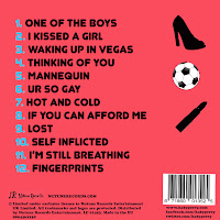
Here is my final digipak:
Front:
Front:

Inlay One:

Inlay Two:

Back Cover:

Here is my final magazine advert:

Monday 4 February 2013
Permission Request
Today I sent an email to Katy Perry's agent, for copyright purposes. Here is a screen shot of the email I sent asking for permission to use the track, 'One of the Boys'.


Sunday 3 February 2013
Rough Cut 2 Feedback
Feedback
I have roughly finished my music video, because it is all complete, but the middle looks a bit messy I think. Also they said the lip sync needs to be fixed in places. I was also told that the upbeat video and narrative is really interesting. I showed my video to other people and they have agreed.
To improve this I am going to edit the video here is my plan...
- From 1.07 put in some stronger shots of the chorus on the white background (-1.21)
- 1.34-1.40 stop the quick cuts, and find stronger footage to use, so that it doesn't look too fast and messy.
- 2.22 Remove the short scene of them on the weight arcade game, and use the end of the chorus to show more establishing shots of the pier, and her in her bedroom.
- 2.35 'I wanna be a flower...' Show them walking together in the pier, and use a transparent shot of her lip syncing.
- Use shots of the 3 girls lip syncing together on pier, and cut it in with the pier scene.
- Build up to fight scene, 'don't wanna be....' fade in shots of 2 girls lip syncing at either side of the screen, whilst showing the fight building. This way it will seem like the two 'girly girls' are voices in her head.
- Ending 'do do do's' shot of characters from throughout the video, and will end with a shot of a 'The End' sign.
Saturday 2 February 2013
Diary!
1. Album Progress Update
I am not very good at using photoshop, and after hours of trying to figure out the tools I have only made a very basic uninteresting front cover!

I am not very good at using photoshop, and after hours of trying to figure out the tools I have only made a very basic uninteresting front cover!

Therefore I have decided I am going to make detailed drawings of what I want the album and magazine advert to look like so that I don't forget. I can then show my ideas to other people who can teach me how to import my ideas onto photoshop.
2. Editing Update
Yesterday, there were quite a few technical errors in lesson and I wasn't able to get much done. Today I planned to spend four hours working on my editing whist the room was free to get the editing a lot closer to being finished. Unfortunately, final cut pro is playing up again, and as this isn't a lesson I can not get help to fix it. Therefore for now I plan to just focus on my digipak designs and hope the computer is fixed again soon!
Also I planned to film a shot of a game on the pier saying 'Game Over' to put at the end of my video. I didn't find a game with that shot on it, so therefore I plan to use a 'Game Over' or 'The End' sign made on photoshop or online. Something looking like this...
Friday 1 February 2013
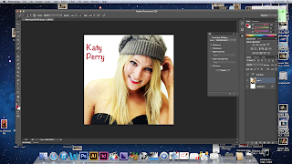
Album And Magazine Advert ROUGH
After getting some help from teachers and peers, I have been able to use photoshop to create an album and a magazine advert. I decided to change the front cover picture and use that particular image on an inlay instead. Instead of using the original design for Inlay one, I used a photo and put internet details on the back cover. I also used a QR code maker online to make a QR code that can be scanned by smartphones, and it will take viewers to the Katy Perry website. This is more advanced than my original plan, so hopefully will appeal to a wider audience by using up to date technology.


I found that photoshop allowed me to be more creative, for example, I researched the text that Katy Perry albums use, and was able to download them off a website called dafont.com. This will hopefully help make my products better than planned.
There are still some parts of photoshop that I need some guidance on understanding. For example, I want to make the 'Katy Perry' Text have a colour shading effect. Here are my rough edits of the album and the magazine advert.
Album Cover:
 I ended up using a different photo for my album cover, because there was not enough free space to write album details on the front cover with my original plan. I have still used the photo I wanted to use, but as the first inlay. This worked out well, because I was able to make a QR code for advertising. I also put links to Katy Perry's website, facebook and twitter on the back of the album in small print under the barcode.
Inlay 1:
 Looking at this album inlay along side the rest of the album, I think I have edited the image's brightness too much, and I need to sort it out. I think this is a nice picture though, and Katy Perry often has a more flattering picture inside the album cover.
Inlay 2:
 I am happy with this inlay. I got the text for Pink Ladies online, I was planning to use the photo I took of the back of the jacket. I got the text offline, because the picture I got was blurry, and this way the inlay has turned out to a higher quality more professional standard.
Back Cover:
 I like this back cover, because of the outlines of shapes and the contrasting baby blue colour used to number the tracks. I also created a record label called, 'Nutune Records' and I have inserted it just above the small print (copyright details).
Magazine Advert:

Feedback I have gained from these texts after showing peers:
-Need to outline the Artist name and album name so that they stand out more.
-I like the bright colours
-Edit the photos so they are all the same brightness
-I like the pink ladies theme
Tuesday 29 January 2013
Home Shoot TAKE 3 Planning
Tomorrow I plan to re-re-film the shoot at home!
I have filmed it once will Molly, and I have filmed it once with Vanessa. Obviously with Molly the cast changed, hence I filmed with Vanessa, but at the first attempt filming at home with Vanessa the camera died.
Therefore tomorrow I am going to film the same shots again, and because I am filming at my house, it will be exactly the same as the shoot with Molly. I will make sure there is no clutter in the background this time, because that looks unprofessional.
Props
- Hat
- Magazines
- Mirror
- Hairbrush
- Lipstick
- Straighteners
- Nail varnish
- Perfume
- Sock
I plan to flim the same shots along with an extra part of the bridge, 'I wanna smell like roses not a baseball team'. Here I plan to have low angle shot of her spraying and smelling perfume then she falls onto the bed, and there is a shot from above, 'not a baseball team' and she will pull out a sock that she fell on.
Monday 28 January 2013
Diary!
Today I have designed and annotated my album designs. I plan to make this album on photoshop, but I decided to show it to my younger sister who is a 14 year old girl (my target audience), and her friend who are the same age.
Here are my album designs:
Here are my album designs:


Here is my feedback:
Sophie, aged 14-- It stands out, because it has bright colours. It looks kind of pop art it, and yeah that's cool. I would probably buy it.
Caitlin, aged 14-
- If it was the actual Katy Perry I would buy it. It looks good. I think it's good for 14 year olds, but it might look a bit young for older people.
From my feedback I am going to make sure the colours aren't too bright and gather feedback from people my age to ensure I am not ONLY appealing to younger consumers. To try and make my feedback unbiased I told them it was my friend's designs!
I realised from looking closely at album's that a theme is often carried throughout, and often there is only one main picture. For example, one direction have a 'doodle' theme, to appeal to young girls.

On the first inlay of the album, it says 'Say Hello...' and then gives their Facebook, Twitter, Youtube and their website addresses. Radio one live lounge CD also has promotional info on the inside left cover. In my album cover I chose the wording, 'Check it out...', because Katy Perry is American and it is the colloquial language that teenage girls would use.
I decided to go with the theme of one main photo and then quite plain other sides, this is because I want the album to match the video. She is playing a teenage girl having a crush on a boy, therefore the album needs to show this. I am going to use plain outlines of a high heel, football, lipstick and hat, to relate to the music video.
Sunday 27 January 2013
Extra Shoot Review
Today I filmed with Vanessa and Reuben in college. It was definately the quickest I have filmed, because there was not much to film and I didn't need any lip syncing. We were all laughing at the really cheesey crips I got for Vanessa, which was good because in the footage I got the laughter looks really natural!
I am pleased with the shots I got, and I am now going to use the intertexual reference to 'She's The Man', because I can now copy two of the shots, which were featured in my treatment:
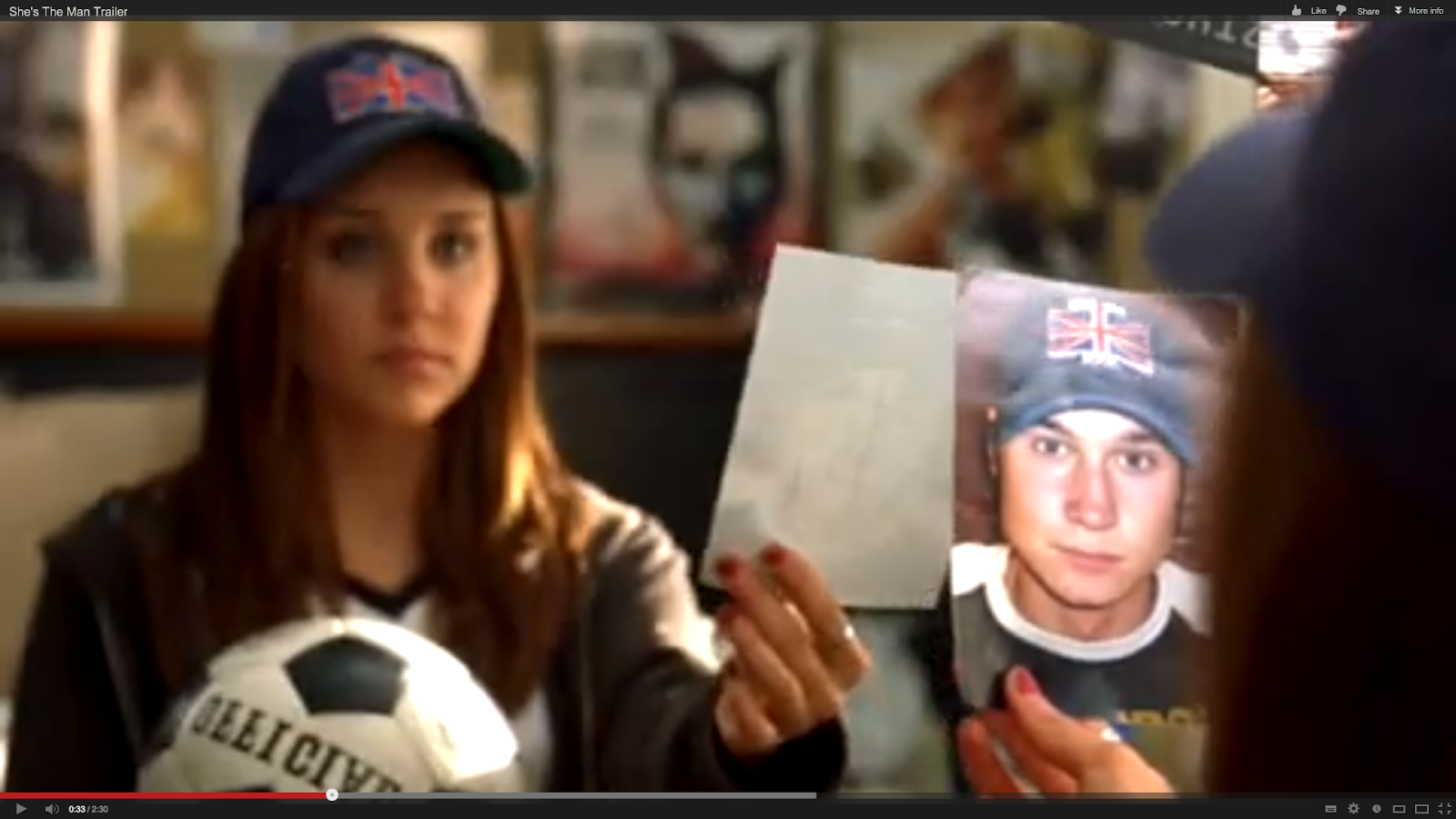
Here are some screen shots of the extra shoot footage in my video in final cut pro. I have put quick cuts of it into the end of the first chorus, to reinforce the fact of her acting like a boy and messing around. Also I got a shot of them taking a picture being silly, I plan to zoom out from the photo of her looking at the photo in her room in the next scene. This is to make the change of setting subtle and continue the narrative.


Friday 25 January 2013
Editing Update
I have been editing all the footage together for a while now, and have realised I should have used a close up in a few places. Therefore I have used the zoom button to change a few shots, for example I have made a short close up of the pier game saying, 'RELOAD'. Also a close up of Reuben dropping his pen.


From re watching muic videos such as Hot and Cold by Katy Perry I have realised a variety of quick shots is essential for a upbeat pop video!
I plan to refilm the shoot at home again soon, as the camera ran out of battery and I didn't get enough filming done!


From re watching muic videos such as Hot and Cold by Katy Perry I have realised a variety of quick shots is essential for a upbeat pop video!
I plan to refilm the shoot at home again soon, as the camera ran out of battery and I didn't get enough filming done!
Extra Shoot Plan
I have started editing my music video together and have realised that I want to make the video more exciting by connecting the end of the first chorous with the scene filmed at home, to emphasis her changing (match the lyrics). Therefore I plan to film Vanessa and Reuben messing around with Vanessa eating like a pig, and them laughing, and then take a photo and her be looking at the photo in her room. If I edit the footage quickly and use quick shots I should be hopefully able to feed it into the chorous.

Here is my plan:

Thursday 24 January 2013
Rough Cut
Here is a very rough cut of my music video, I have not yet edited the chorous or finished any of the verses. This is a quick outline of what my video will be like, and I showed it to the class to get feedback so that I can find out if I am starting along the right lines or not.
FEEDBACK FROM CLASS
- Complex editing - looks really good! Just need to speed up the second bit :) But we like! :)
- Lip sync off in places, like the quick range of cuts at the start, good range of locations.
- Looking really good - well done! Keep up the quick cuts.
- Good variety of shots, good use of location and props.
- Music matches the video
Wednesday 23 January 2013
Summer Shoot Review
Today I filmed the part of the song where she walks into school after having a makeover over summer. This is to match the lyrics
"Over the summer something changed...
and I walked right into school and caught you staring at me!
'Cause I know, what you know, and now you're gonna have to take a number.
It's okay, maybe one day,
But not until you give me my diamond ring."
I filmed shots where the visuals will match the lyrics for 'staring at me' and for 'take a number I got a shot of her arm pushing him away.
I think this shoot went well, the sun was shining a bit today, and Vanessa was in a summery dress and heels, and reuben was in a summer t-shirt. I used a close up of her heels as she walked in, and used a low angle shot to show her now being superior. I also got someone to hold a hairdryer to her face as she walked in, so that it looked like her hair was blowing in the wind. Although, on the first attempt the hairdryer was on hot and Vanessa started running away half way through filming, because of being burnt! Eventually I got a shot of her walking in lip syncing and without running away from the hairdryer!
Overall I am very happy with todays shoot, and think that the footage will look good. I took a variety of close ups to show emotions, for example, Reubens shocked face and then two close ups of him dropping his pen.
Monday 21 January 2013
Pier Shoot Review
Today Me, Vanessa, Georgina and Reuben went to the pier to film the 'summer' part of the song. I planned the main dramatic part of the song to be when they are eating ice creams in an ice cream parlour. Today, because it was freezing and it was snowing outside, the ice cream parlour wasn't open and no where on the pier was open to buy ice cream! Although, the pier was pretty quiet so there wasn't many other people wanting to use the arcade games, and we didn't get too many strange looks for dressing for sun in the snow.
I improvised and used a killing game to contrast with a girlie dance game. I used a shot to show Reuben looking at Georgina, and then Vanessa attacked her.
Although it didn't go to plan, I think it may still look okay, but if it isn't long enough or dramatic enough, I will refilm with ice cream!
I improvised and used a killing game to contrast with a girlie dance game. I used a shot to show Reuben looking at Georgina, and then Vanessa attacked her.
Although it didn't go to plan, I think it may still look okay, but if it isn't long enough or dramatic enough, I will refilm with ice cream!
Wednesday 16 January 2013
Home Shoot Review
Today I wanted to refilm the shots that I got with Molly at home having a 'girlie makeover', but this time with Vanessa. I think the filming was awful. I tried to get the same shots as I did with Molly, but the lighting was awful, and the camera died after 10mins therefore I have hardly any footage and I don't think it looks as good quality as the rest of my footage (because of the lighting). I am definately going to refilm this with a fully charged camera and not in the evening so that there is some natural light.
I am going to use the footage I have filmed in my rough cut, so that the audience will have an idea of what I want my music video to be like, but I will definately REFILM!
Here is the footage that I did film that I have edited together-
I am going to use the footage I have filmed in my rough cut, so that the audience will have an idea of what I want my music video to be like, but I will definately REFILM!
Here is the footage that I did film that I have edited together-
Monday 14 January 2013
White Background Review
Yesterday's shoot went well, and I took photos for my digipak, here are all the photos taken on a contact sheet.


Friday 11 January 2013
Hallway Shoot TAKE 2 Review
Today I filmed again in the hallway in college. I needed to get the shot I planned of me and Georgina singing 'do do do' doing our makeup and then it pans down to Vanessa on the floor. I needed to use a different location so that it doesn't look like me and Georgina disappear, so I decided to use a white wall on a stairway. I have realised from watching pop videos that the artist often travels a lot to make the song more upbeat, hence I am going to make Vanessa jump round the stairs and run to the corridor where we filmed earlier this week.
Hot and Cold by Katy Perry is a great example of quick cuts and the artist traveling quick to make an upbeat music video.
Tuesday 8 January 2013
Hallway Shoot Review
Today I filmed Vanessa acting boyish in college. To match the lyrics-
"And I take these suckers down 'cause they just get in my way.
The way you look at me,
Is kinda like a little sister,
Your high fives, your goodbyes,
And it leaves me nothing but blisters".
Vanessa wore a beanie hat, a jumper and trainers, had her hair tied up and not much makeup. I actually planned to film the begining of the song as well but Georgina (other girly girl) was not in.
Ryan, Will, and Reuben were in the corridoor and Vanessa walks over and pushes ryan over. I made sure I got a variety of shots and Vanessa lip synced 'get in my way' and 'blisters'.
I used an over the shoulder shot to show Reuben walking off putting his arm around another girl, unfortunately as Georgina wasn't in, I had to press record and then run down the corridor for Reuben to put his arm round me. Hopefully when I edit it all together it will look fine.
Friday 4 January 2013
Diary!
Today I was thinking about how I can make my video and ancillary texts have a continuous theme. I went into town and had a look around the shops for extra props, and ended up in a fancy dress shop. I suddenly had a lot of ideas about making my video more exciting by adding crazy fancy dress outfits. Although, sadly I am on a budget and I don't think I should change my music video pitch dramatically before I have tried out my orginal ideas.
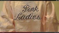
However, I did manage to find two Pink Ladies jackets, which were the last in stock! I am going to get the two 'girlie girls' wearring these in the white background shoot, and I am going to get the main artist to wear a black leather jacket to resmble the T-Birds in Grease! I am going to go more towards the Pink Ladies theme now, and this will enable me to show a strong connection between my music video and digipak. Here is a photo I took of one of the Pink Ladies jackets:

I did consider getting the two 'girlie girls' to wear the pink ladies jacket throughout the video, and the main artist wear a leather jacket throughtout the video. I decided that I want to use different outfits in different locations throughout the video, and that way my music video will seem modern day, and not a remake of the concept of grease. (Just an intertexual reference!)
Subscribe to:
Posts (Atom)